2022
San Pedro Parques
Branding / Product Design / UI UX
Lead Designer (UI/UX & Branding)
San Pedro Parques manages multiple public spaces across the Municipality of San Pedro, each offering different activities, services, and community events. Prior to this project, the parks lacked a unified visual system, resulting in inconsistent signage, fragmented communication, and difficulty for visitors to navigate and understand available spaces.
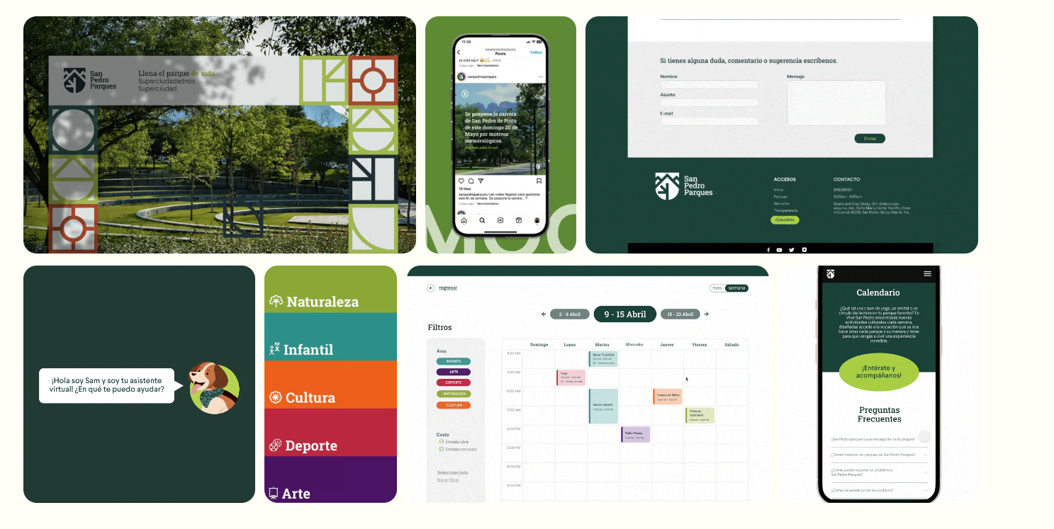
This project focused on designing a cohesive visual and interaction system that improves orientation, accessibility, and sense of belonging across all parks. The solution connects physical signage, iconography, and communication assets into a scalable system adaptable to different park contexts and uses.
Design a unified visual and interaction system that improves navigation, accessibility, and identity across San Pedro’s public parks, while enabling scalability for future events, expansions, and communication needs.
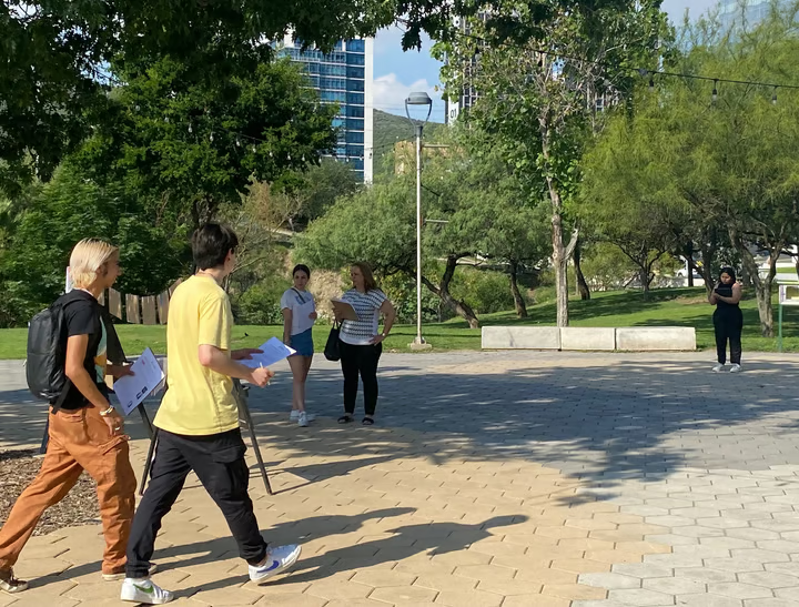
Led the UI/UX and branding design process, defining the visual system, iconography, and interaction principles for physical and communication assets. Designed wayfinding logic, information hierarchy, and validation through prototyping to ensure clarity, usability, and consistency across all park environments.
San Pedro’s public parks operated without a unified visual and interaction system. Each park communicated independently, resulting in inconsistent signage, unclear information hierarchy, and limited orientation for visitors.
This fragmentation made it difficult for users to understand available spaces, activities, and services, reducing accessibility and overall park usability.

The design strategy focused on building a unified system capable of working across all parks while remaining flexible for different environments and uses.
Accessibility, clarity, and inclusivity were prioritized to ensure the system could be understood by users of all ages and backgrounds.
The system was designed to scale across physical signage, communication materials, and event applications.
A clear information hierarchy was defined to help users quickly identify locations, activities, and services within the parks.
Visual rules, layout principles, and consistent labeling reduce cognitive load and allow visitors to navigate spaces intuitively.
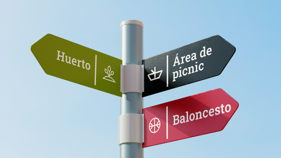
A custom iconographic system was designed to support fast recognition and intuitive navigation.
Icons were built on a shared grid to ensure consistency, legibility, and accessibility across physical and digital applications.
The final result is a cohesive visual and interaction system that improves orientation, accessibility, and identity across all public parks.
The system provides a solid foundation for future park expansions, events, and communication needs.